Back away from the caps lock. Hands off the background colors. When it comes to formatting emails, minimalism works best.
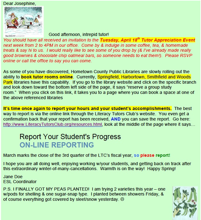
Have you ever received an email like this one to Josephine? It’s proof that too much formatting makes your email unreadable.
Don’t pretty-up your emails
If you are tempted to add lots of color, use many different fonts, or drop in some super-cute clip art, please reconsider. Using too much formatting is confusing and unprofessional. Write your emails clearly and concisely, then stick to the formatting basics: crisp black text on a clean white background. Use white space to show how ideas are grouped.
How often should you use these formatting options in your emails?

Four things to remember about formatting emails:
- A little formatting goes a long way. If you use bold or color to make certain words stand out in an email, use only a little. After all, the special words need to look different to stand out. When you use too much formatting, everything looks the same.
- Readers can usually understand two font effects, not more. Let’s say you are writing an email that contains instructions on how to submit an online application. You might bold the first word in each step: ” (1) Create account; (2) Review personal information; (3) Upload resume…” You might use italics for an explanatory note: “Note: You cannot revise your application after you have submitted it.” In this example, you have used two font effects: bold and italics. In most cases, the reader will understand that the bolded words indicate steps in a sequence and the italicized words indicate an explanation. But if you use a third effect–red font, for example–you’ll probably just confuse your reader.
- White space does the most work. Because white space shows how ideas are grouped and the number of ideas in your email, it’s the formatting tool that helps readers most. Use white space carefully and purposefully. Your readers will be grateful.
- Work email is different from personal email. In your personal emails, you just go ahead and add as much formatting as you’d like. Use a yellow font on an orange background. Insert row upon row of emoticons. Add pithy quotations and Bible verses to your signature, each in a different font. Your friends and family will let you know if they’ve stopped reading your email because, well, they can’t read your email!


I love this! Should be required reading for some in my office.
So glad you liked the article, Colleen. Maybe you should slip a hardcopy under your colleague’s door? Difficult to forward the link anonymously…
Amen.